
Network Connectivity Diagrams At The Heart Of The Network Lifecycle
Imagine an interconnected system of thousands of communication devices, millions of fibers, and countless connectors spanning vast geographic areas. At any given moment, thousands of businesses, organizations, and individuals depend on your network, expecting flawless, continuous service. And here are your teams working hard to plan, construct, provision, troubleshoot, and deliver value through every stage of the network lifecycle.
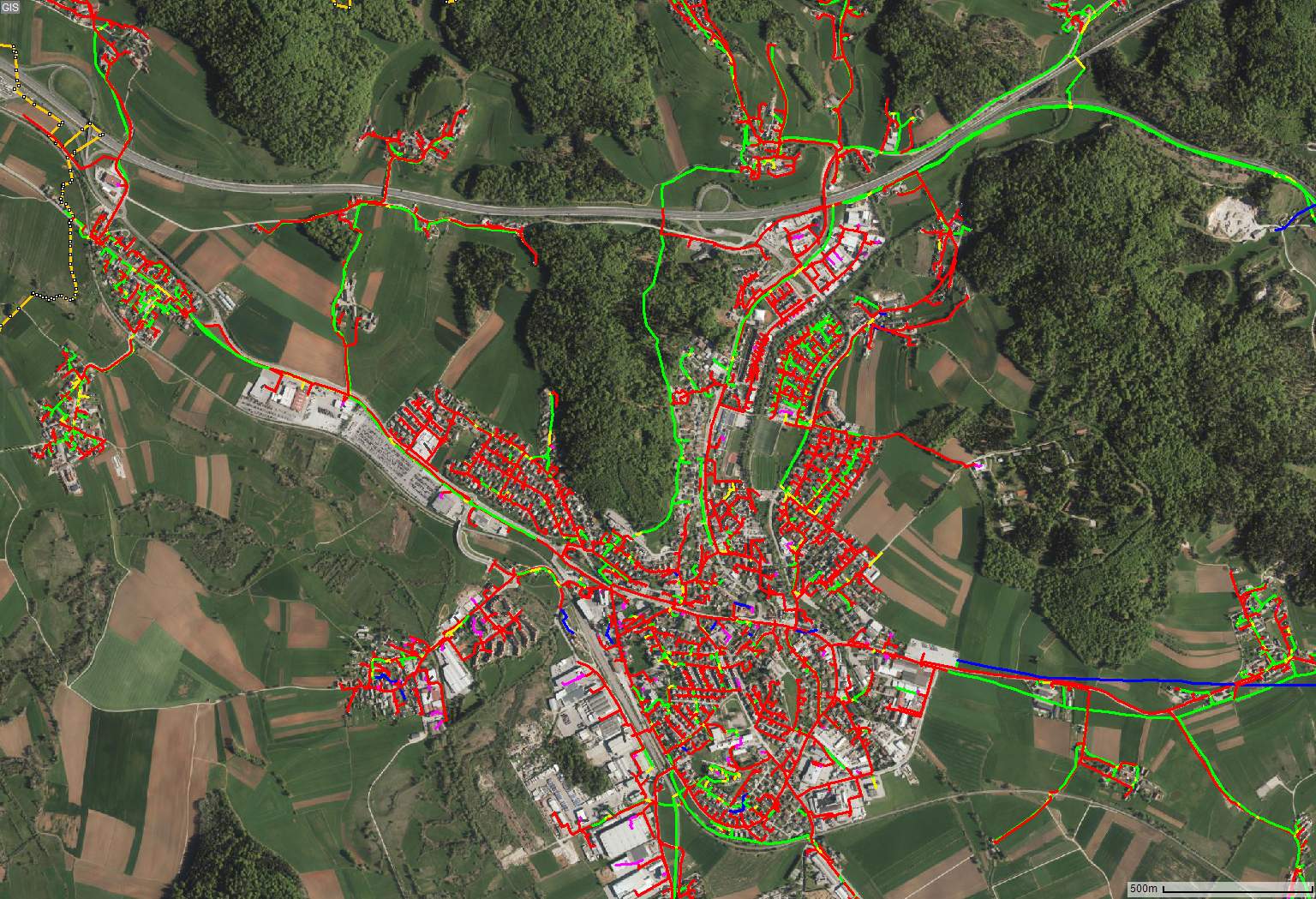
Figure 1 – An example of a dense FO network in a city district
You are investing in a high-performance operational framework, optimized workflows, scalable systems, and a skilled, data-driven workforce—to accelerate business outcomes in the dynamic and competitive telecom landscape. Every detail matters, but efficient network connectivity diagrams make the difference between accelerating processes and holding them back. Diagram creation, update, manipulation, or export are the most frequently executed tasks within any telecom process. Increase the efficiency of diagrams and overall operational efficiency will meet completely new heights.

Figure 2: Example of automatically generated network connectivity diagram
Efficiency Gain: Real-life use case
Automatically generating diagrams directly from the database delivers a substantial improvement in efficiency. Traditionally, two diagrams are prepared manually: a high-level single-line diagram and a low-level splice diagram for a selected network segment. Creating these from scratch with tools like AutoCAD or even some native Physical Network Inventory (PNI) tools available on the market today typically takes several hours to several days, depending on the network size. By contrast, automatic generation produces any desired view — at any level of detail — within seconds. Engineers can therefore spend time on better network design and make more thoughtful decisions instead of drawing lines and dots that drain their precious capacity.
Manual diagrams also require time-consuming updates whenever the network changes, often adding tens of minutes or even hours. Automated tools, however, generate updated, interactive diagrams instantly, on demand.
In collaboration with a partner telecom operator, we analyzed a typical service provisioning process — from locating the customer and identifying available fiber and equipment capacity, to connecting the customer and updating relevant documentation. This study showed that automated diagram generation can reduce overall provisioning time by 45% - 75%.
*To clarify calculations, you can request a meeting with us here.
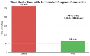
Figure 3: Time reduction
The Cost Of Outdated Diagrams
As we have seen, manually created diagrams take hours and skilled personnel. As a result, these diagrams can quickly become outdated and are unable to accommodate immediate requests for different views or levels of detail. Consequently, you need to open various tools or windows and manually map information from multiple sources to gain a relevant understanding of the network. Not to mention unnecessary site visits and field repairs resulting from incorrect data inside outdated diagrams. One site visit might cost 500 +/- EUR.
The Hidden Challenges Of Diagramming Tools
Automation can greatly improve efficiency, provided that the results it produces are consistently useful. However, this is not always the case. If the automation tool fails to deliver visually clear, trustworthy outputs at your network’s size or lacks the flexibility to adjust diagrams to the desired view, its usefulness is limited. Such potential shortcomings in tools can be dealbreakers for a telecom professional who demands consistent quality and performance under all conditions. Therefore, we explore below the key features to consider when selecting a new automated diagram generation tool.
Which Features Matter Most When Deciding On A New Tool For Creating Diagrams?
1. Automated diagram generation
The tool must generate diagrams automatically from your database in seconds even for a large network size. The tool must recognize your data format seamlessly and accurately display all relevant network elements and connections. Just by switching from manual to automatic diagram creation saves hours of manual work.
2. Visual clarity and consistency
Refers to how easy the diagram is to read and understand. Do you see cluttered connection lines that are crossed excessively, contain sharp corners, or have overlapping network elements and labels? Not wanted. You need a first-time perfect view, as well as a consistent and predictable position of network elements, regardless of the network size. Technicians would love it.
3. Interactivity
Can you dynamically navigate between all levels of detail, from a high-level overview down to a specific fiber or port, intuitively? Can you click on to show or hide parts of the network, trace paths, view network elements based on their status (e.g., as-built, planned)? Make it interactive: One data, any view, immediately. Forget Static: fixed single-line diagram or a low-level splice diagram, not clickable, separated.
4. Accuracy and Completeness
All data is visualized with high fidelity, always guaranteeing a consistent and exact reflection of the source data in the diagram - complete and free of errors. Leave your doubts behind; you must always trust your diagram.
5. Bidirectional link between map view and schematic diagram
Select a section of the network in the map window, and a schematic for the selected section must be generated in a separate window. Click a network element or connection in the diagram, and the corresponding part must be highlighted in the GIS window. Make this context switch effortlessly.
6. Data driven visualization
The visual appearance (colors, symbols, and line widths) of network components changes dynamically based on their underlying data attributes. For example, it can be visually distinguished between occupied (red) and available (green) fibers or ports. Fibers can be color-coded based on their status, such as planned, in-service, or decommissioned.
7. Customization / Configurability
You must be able to customize symbology, colours, layouts, and templates to meet specific company requirements or standards. Master your visuals; do not settle for defaults.
8. Export and Offline Work
Export diagrams to various formats (e.g., PDF, SVG, AutoCAD DWG) for printing, sharing, or offline use in the field.
9. Integration
Ensure the tool can be easily integrated via API into the existing network management system. Verify compatibility with the data formats in your database or check the tool provider's ability to adjust it to your specific data format.
Meet our technical team, see DEMO
Choosing the right tool is a significant step forward in increasing operational efficiency. As we have seen, shortfalls in areas like visual clarity, speed, or accuracy can lead to hidden costs and inefficiencies that impact everything from daily operations to long-term strategic planning.
The challenge, however, often lies in finding a solution that meets most of the above criteria. Our tool, iNTERACTIVE SCHEMATICS™, was designed from the ground up to meet all these demanding criteria. It transforms complex network data into clear, dynamic, and accurate diagrams that empower teams to make better, faster decisions. Importantly, it can be integrated with all operational support systems and fiber management systems on the market.
To see how iNTERACTIVE SCHEMATICS™ meets the criteria and whether it meets your requirements, click on a demo video here. You can also schedule a call with our technical experts by filling a contact form below.